
An Optimal Experience For Mobile Users
OASIS has been developed to encourage implementation of your new website using Responsive Design best practices.
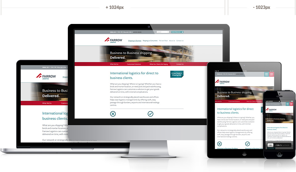
Through increasing implementation of responsive design and use of multiple style sheets that are responsive to requesting devices (e.g., smart phones and tablets), OASIS delivers powerful results across a range of devices in today’s diversified device world. Rendering to iPhone, Android, BlackBerry phones and tablets as well as desktop devices is absolutely handled - and well - by OASIS web CMS.